

Excel Sparklines were introduced in Excel 2010 version. It is small line chart that could be easily embedded with the text and gives a great presentable output for easier depiction when aligned next to the tabular data. They are supported in Excel 2010 and above version only.
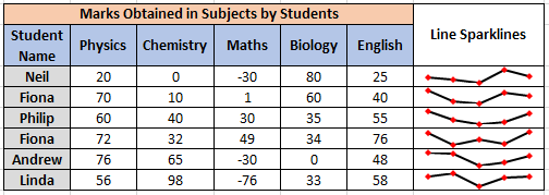
Although sparkline’s design is not limited to lines they can also be represented as columns or win loss. The below example depicts how sparklines look:

When to Use:
Excel Sparklines can be useful if you have your data in a tabular format. You can place the sparklines next to each row to give a clear graphical presentation of the data selected in that particular row.
How to Use:
Below listed steps give a clear understanding on how to use excel sparklines:
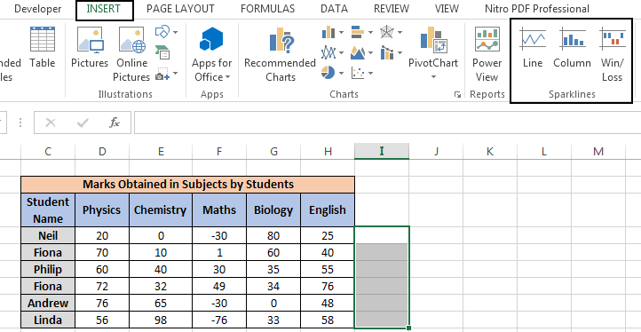
- Click on the cell where you want to insert the “Sparkline(s)”.
- Go the “Insert” tab on the top ribbon.
- Select the Type of “Sparkline” (Line, Column, Win/ Loss), in this case we will take “Line Sparkline” as example.
Line Type of Sparklines So, this was all about how to use excel sparklines. You can also do formatting, add markers, axis, etc to enhance the sparklines. Below section suggests on type of sparklines and their formatting.
Type of Excel Sparklines:
- Line – These sparklines are displayed in the format of simple lines. You could change the style of line, sparkline color and marker color.
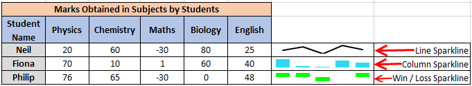
- Column – These sparklines are displayed in the format of bars. If the data is of positive value then the column would be lying on the upper axis. For negative data value the column would be below the axis. Likewise for zero value the column would not be displayed and an empty space would be left at that data point. In these sparklines too, you can change the style of column, sparkline color and marker color.
- Win / Loss – These sparklines are displayed in the format of bars like “Column” sparklines although these only represent profit or loss. If the data is showing profit (positive data points) then bars would be above the axis and if the data is showing loss (negative data points) then the bars would be inverted and will be below the axis. If the data is of zero value then the column would not be displayed and an empty space would be left at that data point, as shown in above figure as well. In these sparklines as well, you can change the style of column, sparkline color and marker color.
You can change the type of sparklines for the whole group or for single row by un-grouping the sparklines first. Thus each row can have a different type of sparkline.
Leave a Comment